
Have you ever wondered why your eyes immediately focus on a sign while a blue room can make you feel peaceful? Why does red make a sale banner look urgent while green can make you think of nature, health, and starting over? These reactions might seem easy to understand. They often show the link between color, perception, and feeling. The psychology of colors looks at how people see shades and how those shades can affect emotions, attention, behavior, and what people expect. Color does not affect every person the same way. Personal experiences, culture, memories, and what they like can all change how a person feels about a certain color.
In this article, we will talk about the psychology of colors, their meanings, and typical uses of blue, grey, pink, black, yellow, green, orange, purple, and white. We will also talk about how colors can affect your psychoaura and why choosing colors carefully can help create environments. You can visit the Best Psychologist in Rawalpindi at PsychoAura to find help and discover more about emotional health. Let us look at what different colors might mean.
Key Takeaways
- The psychology of colors looks at how different colors can shape feelings, focus, how things are seen, and how people act.
- Not everyone reacts to color in the same way. Personal history and favorite colors make a difference.
- Culture plays a role in what meaning people give to colors.
- Colors do not have one fixed meaning for everyone. What the color means depends on the situation. What someone has experienced.
- Choosing colors carefully can help build spaces that feel meaningful, improve how messages are seen, and support a mood. It can also help strengthen your energy or psychoaura.
Interesting Facts About The Psychology of Colors
- Color associations are not universal. Culture, memories, age, environment, and personal experiences can influence how Color makes people feel.
- Color can grab attention. High contrast and bright colors usually stand out more than shades.
- Lighting changes how color looks. Natural daylight, bulbs, and cool lighting can make the same paint look very different.
- Brand colors shape impressions. Businesses often choose colors that match the character they want their visual identity to show.
- Personal preference matters. A color that feels calm to one person may feel uncomfortable or boring to another.
What is the Psychology of Colors?
The psychology of colors is the study of how colors affect perception, emotions, attention, and behaviour. The psychology of colors is used in marketing, design, environmental studies, and other fields. However, the psychology of colors is not a fixed dictionary. Red does not always make every person angry. Blue does not always make someone feel relaxed. Context matters. A soft blue bedroom may create an atmosphere for one person while the same color may remind another person of a hard experience. Cultural associations also matter.
People learn meanings from their surroundings and communities. A color used for celebration in one culture may have a different meaning in another culture. For this reason, it is more accurate to see color as a cue than a universal emotional command.
Red Color
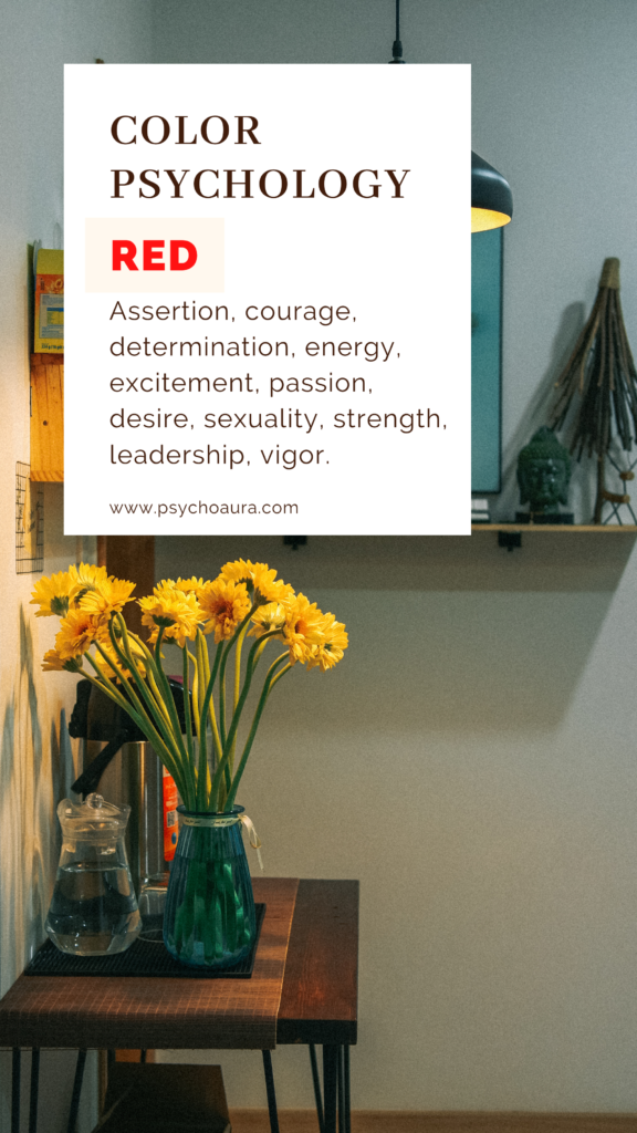
The Color of Intensity and Impact. Red naturally draws the eye. It can show energy, passion, urgency, confidence, and excitement. You can see its effect in warning signs, special offers, sports logos, and restaurant decor. The study of colors often talks about red because of how it appears. A vivid red item can be noticed fast against a background, which makes the color helpful when something needs to be seen away.
Red also has layers. It can show love and romance. It can also show anger or risk. The situation changes the meaning a lot. For instance, a red heart can feel warm, while a sign of warning shows caution. Designers therefore must think about the pictures around the words used and the goal before picking this color.
Blue Color
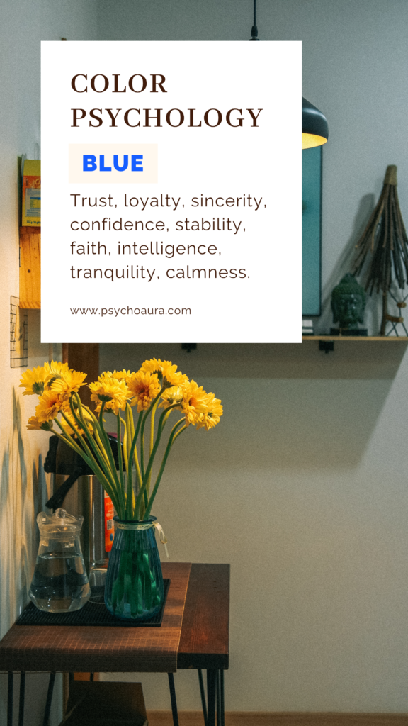
Blue is related to mental calmness, steadiness, trust, and professionalism. This color is especially important for marketing, offices, hospital rooms, and tech. Businesses sometimes use Blue when they want a blue look to feel trustworthy and neat. Different shades can show feelings. Pale Blue may look soft and peaceful, while Navy Blue can feel formal and strong. Other colors also affect the feel. If you are designing an office, blue accents may create an atmosphere. Still, balance is key. Many colors can make an office feel cold or unwelcoming.
Grey Color
Grey is positioned between black and white, which makes it a helpful color for creating balance and neutrality. It can show professionalism, maturity, restraint, and sophistication without trying to stand out. Modern technology, architecture, fashion, and corporate design often use grey because it goes well with shades. A grey background can help other colors stand out more. From a point of view, grey can feel calm and controlled. However, a lot of grey can also give some people a feeling of being bored or uninterested. Combining grey with blue can create an environment, while using yellow or orange can bring in energy and warmth.
Pink Color
Pink color represents love, care, support, kindness, and emotional comfort. Lighter tones of pink can create an environment, while bolder pinks might feel lively, young, and full of energy. Pink is often seen in places focused on health and wellbeing, in beauty brands, in campaigns for awareness, and in products that relate to self care. Its emotional connections can make a place feel welcoming. Pink does not always mean the same thing. Social ideas and personal experiences shape how people see it. A modern design might use pink to show imagination or just softness. When used with care, pink can bring a sense of warmth to a space without being too much for the senses.
Black
Black carries a visual identity. It represents elegance, authority, mystery, strength, and luxury. Many fashion designers and high end brands choose black because it gives a commanding presence. The psychology of colors shows how deep black can be. In some situations, black can stand for formality. It can also help build a mood. Black pairs with white, gold, silver, or bright accent colors. A black background makes other colors stand out more. Too much black at once can make spaces feel dark or tight. Designers can balance this by using textures, warm lighting, or lighter shades. This keeps the look strong but not overwhelming.
Yellow
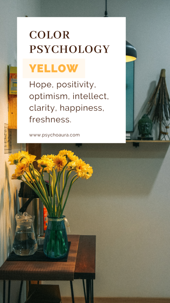
Yellow color represents sunshine, brightness, playfulness, and energy to the mind. Yellow can create an impression and attract attention quickly. That makes Yellow useful in advertising, children’s products, creative spaces, packaging, and visual campaigns. Yellow can help important elements stand out. Bright Yellow can become visually overwhelming when used too much. Some individuals may also associate stimulating environments with restlessness or understand anxiety. A softer Yellow can create warmth without the intensity. Using Yellow as an accent rather than covering an entire space can help maintain visual balance.
Green
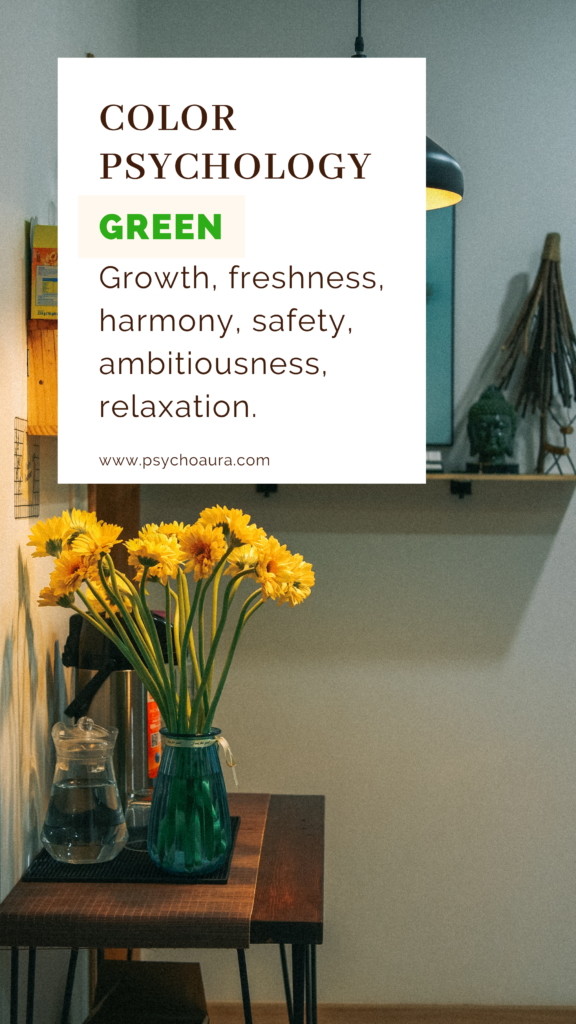
Green is always linked to leaves, gardens, forests, and fresh plants. These links often make people think about Green, growth, renewal, balance, and nature. The psychology of colors often ties Green to environments. Healthcare, wellness, agriculture, sustainability, and organic brands often use Green to share health related ideas. Green also shows up in branding because people commonly link Green with prosperity and growth. Again, context decides the message. Light Green can feel fresh and peaceful while deep Green may appear sophisticated and grounded. Bringing plants into a workplace or home can also bring Green naturally while adding texture and visual variety.
Orange
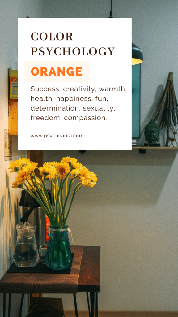
Orange brings together the warmth of red and the brightness that is connected with yellow. The outcome feels energetic, friendly, playful, and inviting. Companies often choose orange when they want to show movement and excitement without using the feelings that come with red. It can be very useful in sports branding, creative projects, childrens items, events, and focused designs. Orange can also create a feeling of warmth. A restaurant, a place for recreation, or a creative office might use it to make the environment more lively. Since orange has a lot of energy, using it in moderation can help. Combining it with shades can make the whole design more comfortable to look at.
Purple
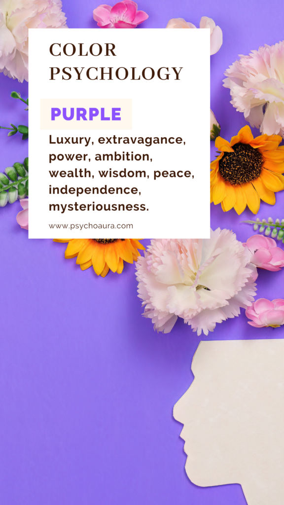
It is associated with luxury, creativity, mystery, spirituality, and imagination. It comes from mixing red and blue, giving it a look that can feel both strong and soothing at the same time. In color psychology, purple is often tied to thinking and deep symbolic meaning. That is why beauty brands, art projects, wellness areas, and high end products sometimes choose purple to stand out and make a statement. Lavender gives a calmer feeling, like peace. Deep violet feels bold and rich, like something dramatic. The exact shade, how bright or dim the light is and what colors are all change how people see purple. Because of this range, purple works well when a brand or space wants to say something that plain neutral colors ever could. It brings energy, mood, and personality.
White Color
It is associated with cleanliness, openness, simplicity, peace, and clarity. It gives a sense of space, making rooms feel bigger and brighter. Hospitals, interiors, healthcare brands, and modern websites often choose white because white offers a clear visual base. Designers use space to separate content and help people read easily.
Conclusion
The psychology of colors influences the way we see the world. The psychology of colors can affect emotions, focus, how we see things, and the choices we make every day. However, the way colors affect people can be different for each person. Learning about these connections can help people make choices when picking colors for their brands, designs for clothes, or for their homes. The meanings of colors also depend on the culture, the situation, memories, and personal experiences. Red might mean love, excitement, or enthusiasm, while blue usually makes people think of calmness and trust. Green is linked to nature, health, and growth. Purple and black can mean creativity, luxury, and class.
These meanings are not the same for everyone, and colors do not control how people act. When used in a certain way, colors can make a place feel better and help create a happy emotional experience. Your personal energy shows not only in the colors around you but also in the feelings and experiences you bring with you. For help with your mental health support, visit the best psychologists in Rawalpindi at PsychoAura for the best support and advice.
FAQs
Can colors influence behavior?
Colors can affect attention, mood, and how things are seen. They do not control what people do. People make choices based on things, not just color.
How do I schedule an appointment at Psychoaura?
The appointment booking process is simple. You can contact Psychoaura directly or fill out an appointment form through the official website.
Can color choices affect health?
Color alone cannot fix health problems. The right colors in a space can make it feel more calming or comfortable. For emotional challenges, professional support is needed.